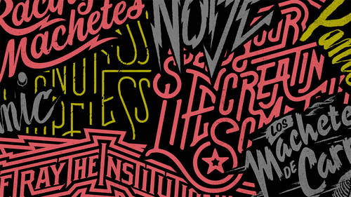
I’m frequently asked by aspiring designers and students alike about the best way to build a type library. With the evergrowing number of font resources – from the small, independent foundries to the mega font resellers and everything inbetween – the task can be overwhelming!
There are two basic approaches: beginning with a font collection, or purchasing one font or family at a time. Let’s begin with the first option. A number of foundries and resellers offer font packages and collections. Some consist of a broad range of both text and display fonts, while others are tailored towards a specific need. A few of the most well known are the Adobe Font Folio collection and their other targeted packages, as well as the Monotype family of font libraries.
Collections can consist of anywhere from a dozen to thousands of typefaces, which can get quite pricey. If you are part of a studio, company, or creative department that is in the process of building a library for a range of projects and clients, font collections might be a good place to begin. This will create a foundation upon which you can build. There is one caveat to remember when using a font collection: resist the temptation to try and make a font fit the job, rather than finding a font that fits the job, even if it means seeking out a different font.
Yes, you can make your own business cards, flyers and invitations! Learn more.

Some foundries and resellers offer smaller font packages that are often bundled on a theme, such as wedding scripts, old west wood type, or a specific holiday. If you use enough of the fonts in a package to make the price worthwhile, go for it. But don’t use these packages as a way to avoid doing a proper font exploration, especially if it doesn’t contain the right font for the job!
For the individual designer or small creative department, font packages and collections can be very costly, and therefore might not the best way to go. The alternative (or in addition) to font collections is building a type library one font at a time. A strong, solid type library need not contain hundreds of typefaces. In fact, many award-winning designers rely on a handful of font families for the majority of their work.
When selecting text faces, go for families that are the most usable and practical; make sure the family has all the weights and versions you might need. In addition, look for fonts that contain the features you use on a regular basis, such as oldstyle and lining figures, true small caps, fractions, ligatures, etc., all of which are available in many OpenType fonts. With display designs, the parameters are much wider; just remember that the font you choose might well be the mainspring of a design, project, or a branding. So take the time to explore all options and choose wisely, and with purpose.
Another advantage of building a type library one-by-one is that you’ll get to know these fonts intimately, so to speak. You’ll become familiar with their personalities, and how they work and behave in a variety of design contexts and environments. They become like old friends. And just like friends, a few good friends you can count on is better than having hundreds of acquaintances that you know superficially, right?
Whichever option you choose, make sure you use a reliable resource, and avoid the temptation to go for the free or very cheap fonts or collections.
Remember: In most cases, you get what you pay (or don’t pay) for … but that is different topic!
Yes, you can make your own business cards, flyers and invitations! Learn more.