The debate over the “perfect website” has been raging for years. Some people are passionate about basic, streamlined pages, while others opt for cutting-edge, image-filled pages loaded with eye-catching items. While we don’t want to pick a side, there are a few things all great websites have in common.
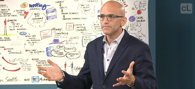
Earlier this week, business pro Michael Port talked about a few of them during his 3-day Book Yourself Solid course. During a short 1-on-1 working session with an in-studio audience member, Michael broke down the proven font and color principles used by every major publication over the last hundred years.
What does your perfect website look like? Comment below and share your thoughts!
Find out all about Michael’s course here: Book Yourself Solid