Figures, also referred to as numerals or numbers, are a frequently-appearing element in typesetting. Not only are they used for addresses, phone numbers, dates and times, but also to indicate prices, quantities, measurements, and more.
Today’s designer has several options when selecting figure styles. Unlike the older Type1 and TrueType font formats that only had room for one set of figures, today’s OpenType fonts can accommodate the four primary figure styles, plus more when called for.

Lining vs. Oldstyle
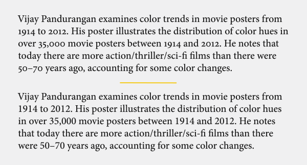
There are two styles of figure: lining and oldstyle. Lining figures, also called aligning, ranging, or cap figures, have matching heights and align on the baseline and cap height, thus the name, aligning. When figures appear in an all cap setting, lining figures work best. Oldstyle figures, also called lowercase figures, are designed to match the appearance of lowercase letterforms by having an x-height as well as ascenders and descenders. Oldstyle figures look very elegant when set in running text, as they blend in beautifully with the upper and lowercase. But if more emphasis is desired, lining figures can be used, as they stand out, as would an all cap word or phrase.
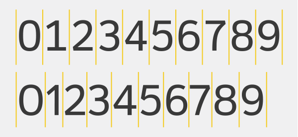
Tabular vs. Proportional
There are two kinds of figure spacing: tabular and proportional. Tabular figures all have the same total character width, which consists of the width of the glyph itself plus the space to its right and left. Tabular spacing is designed to allow numerals to align vertically in tables (thus the term tabular), as well as price lists, invoices, financial statements, and other columns of figures.
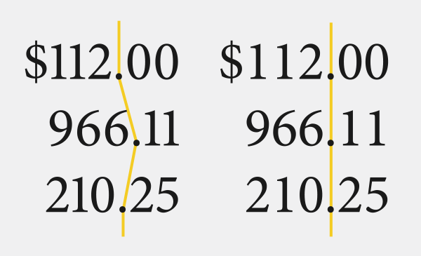
Proportionally-spaced figures, on the other hand, have varying (or proportional) total widths so that they look evenly spaced and balanced. Proportional figures should be used for headlines, subheads, running copy, and any instance that does not require them to be vertically aligned; they should not be used in tables and listings, since they won’t align in vertical columns.
When choosing a font(s) for a project, consider what kind of numerals appear in the text, and then select a font that offers the style(s) of figures you need. While tabular lining figures are the most commonly available figure style—and usually the default in fonts that have more than one style—consider all available figures in the font you are using. Understanding and applying the right figure styles is a sign of typographic know-how and sophistication.