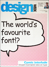
There may not be a designer on the planet who hasn’t heard of Comic Sans. In fact, there may not be any computer-using non-designers who aren’t familiar with — and don’t have an opinion about — Comic Sans. Vincent Connare’s 1995 design for Microsoft has become one of the most popular and most maligned typefaces of our time.
Does this friendly, unassuming typeface deserve the myriad bad raps it has provoked, or is Comic Sans just an unlikely victim of its own success? Here is the backstory, directly from Connare, who also designed the popular web-safe font Trebuchet.

Q. How did you come to design Comic Sans?
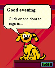
A. I designed Comic Sans while I was working at Microsoft. I had been given a beta version of Microsoft Bob, a comic software package designed primarily for young users. The package featured a dog called Rover, with message balloons set in Times New Roman — a system font oddly unsuited to the comic context. My inspiration for Comic Sans came from the shock of seeing Times New Roman used so inappropriately.
Q. So, who was the target market for Comic Sans?
A. When I designed Comic Sans, there was no expectation of including the font in applications other than those intended for children. But Comic Sans could not be made ready in time for the release of Microsoft Bob, so in August 1995, the font was released in the Windows 95 Plus Pack. Later, it was included as one of the system fonts for the OEM versions of Windows 95. It was also used for a comic movie program called 3D Movie Maker. It currently ships with both Windows and Mac OS.

Q. Why do you think it gained such popularity, and with whom?
A. Back in 1994, Microsoft was making software in anticipation of the day when there would be a computer in every office and in every home. Today, in fact, people have computers in their offices and homes, and in their pockets and purses. Regular people who are not typographers or graphic designers choose Comic Sans because they like it, it’s as simple as that. Comic Sans isn’t complicated, it isn’t sophisticated, it isn’t the same old text typeface like in a newspaper. It’s just fun — and that ‘s why people like it.
Q. What do you think of Comic Sans’ detractors?
A. I think most of them secretly like Comic Sans — or at least wish they had made it. Interesting fact: the main designer at Twitter tweeted that the most server space is used by complaints about: first, airlines; second, Comic Sans; and third, Justin Bieber. So not even The Bieber can beat Comic Sans!
Joking aside, in Simon Garfield’s book, Just My Type, he devotes the first chapter to Comic Sans. It is listed in the book How to Design a Typeface by the Design Museum in London. It has been the subject of an article in every major newspaper in London. And it has been featured on the front page of the Wall Street Journal — on a Friday!