2016 was an interesting year for sure – one dominated by politics and controversy. However, for design, we kept ourselves busy making the world just a little more beautiful whenever and wherever we could. Here are some of the top trends and moments we saw this past year.

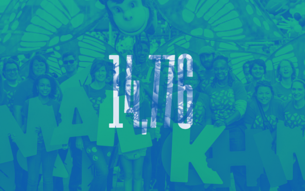
1.) Color Overlays
This treatment appeared on photos everywhere. Some of the many examples include NYC’s Pride 2016 site (below) and MailChimps Year in Review (also below).

2.) All things reminiscent of the 80’s
The graphic shapes and colors from the 80’s made a comeback, as seen in this Spotify campaign (below). And let’s not forget the 80’s inspired Netflix show, Stranger Things which was hugely popular this year. Not to mention the show’s opener which inspired the type personalization site Make It Stranger.


3.) Google’s Material Design
Although it was released in 2015, it became commonplace in 2016 among digital designers (and is a beautiful site to behold). Google’s guide establishes a visual language that ‘synthesizes the classic principles of good design with the innovation and possibility of technology and science.‘ It’s an update of the flat design we saw in the previous years with the addition of light and shadow as well as depth (for interface purposes). Though Google created the guide for web and mobile design, we see the same principles and flat design aesthetic showing up in other formats.

4.) Design Software Gets Competitive
In a space where Adobe has reigned supreme for years, we suddenly saw their dominance threatened by Sketch. Sketch is a vector-based software (currently only available for Mac), popular with UX and product designers that are quietly becoming industry standard for web-related design. Adobe responded by launching Adobe XD, still in Beta.
5.) Lettering + Photography
Lettering continues to trend, and we saw many instances of highly refined brush and script styles combined with photography (below Jessica Hische for IL magazine, and Erik Marinovich for Propel).


6.) Color of 2016
Pantone’s color of 2016 was a combination of two colors, Rose Quartz and Serenity.  “As consumers seek mindfulness and well-being as an antidote to modern day stresses, welcoming colors that psychologically fulfill our yearning for reassurance and security are becoming more prominent. Joined together, Rose Quartz and Serenity demonstrate an inherent balance between a warmer embracing rose tone and the cooler tranquil blue, reflecting connection and wellness as well as a soothing sense of order and peace.” We didn’t see much of this throughout 2016, but their pick for 2017 is promising:
“Greenery bursts forth in 2017 to provide us with the reassurance we yearn for amid a tumultuous social and political environment,” said Leatrice Eiseman, the executive director of the Pantone Color Institute. “This is the color of hopefulness, and of our connection to nature. It speaks to what we call the ‘re’ words: regenerate, refresh, revitalize, renew.”