With the end of 2014 near, it’s time to reflect on what happened in design. We said goodbye to a design legend, and witnessed the legal battle of one of the top font foundries. Website trends aimed to delight, and minimalist design prevailed. The resurgence of the handmade continued — and got a little messier.
1.) RIP Massimo Vignelli. Massimo Vignelli, one of the greatest designers of the 20th century, passed away. He is most well known for his redesign of the NYC subway map and brand guide for the subway system. He is a legend and will be missed. The last few weeks of his death his son Luca put out a call for letters to all those who’s lives had been touched by Vignelli, a touching tribute to a great man.
2) One page scrolling websites proved that they are here to stay.
Parallax scrolling (which allows users to experience moving objects at the same time at different speeds) is everywhere. One of my favorite sites to follow this trend is from KitKat. With advances in programming we can look forward to even more impressive interactive sites to come in 2015!

3) Flat Design
Thanks in part to the Apple operating system, flat design isn’t going anywhere. The absence of drop shadows, bevels, and any other decorative effects keeps things refreshingly minimalist, and I’m all for it.
4) Hoefler Frere Jones break up
One of the leading type foundries, Hoefler Frere-Jones, broke up. Jonathan Hoefler and Tobias Frere-Jones, longtime partners and friends, entered a legal dispute at the beginning of the year over ownership rights. In the end, this longtime pair split and the font foundry became Hoefler and Co. A sad story but an excellent lesson is business best practices.
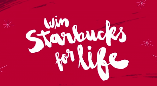
5) Hand Lettering
Over the last year hand lettering continues its popularity. Proving that some of the best design is done manually, not on the computer. We started to see messy brush lettering toward the end of the year with Starbucks holiday branding (see above), and the cover of this CreativeLive ebook. You can bet on more variations of this in 2015.

6) Type-Driven Quotes
Everyone loves a good quote, and they are all over the internet, you can’t get away from them! We even gave one away at CreativeLive!
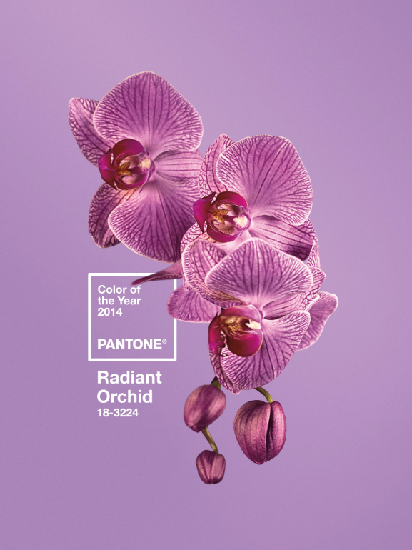
7) Radiant Orchid
I’m not sure if you took note or not, but Pantone’s color of the year 2014 was Radiant Orchid. Don’t worry, the new color is already chosen and waiting for you to use it: Marsala.