Hyphenation is a common occurrence in typography, especially in narrow columns of type. This “necessary evil” is used to create better looking, tighter rags in non-aligned margins, as well as to help achieve more even spacing in justified text. Hyphenation also allows more words to fit in a line. Today’s design software has the ability to control hyphenation in great detail. Although this feature is turned on by default with preset parameters, these settings can be altered, or turned off entirely, for anything from a paragraph to an entire article.
The default settings usually allow two-letter hyphenations, as well as anywhere from three to unlimited consecutive hyphenations. This is an overly generous setting for most text, and one that can reduce readability. It is generally considered acceptable to have two consecutive hyphenated lines, but no more. In addition, be careful not to have too many hyphenations in a paragraph, even if they are not in successive rows.
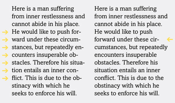
The paragraph on the left has an unsightly seven hyphens in a row! It can be remedied by changing the Hyphenation settings, as well as some manual tweaking. Text from I Ching.
For the best looking typography, always customize these settings. My preference – and recommendation – is to change the default settings to allow a minimum of three-letter hyphenations, and no more than two in a row. (Note that hyphenation settings can also be customized in Paragraph Styles.) (B)

Typical default Hyphenation settings are indicated in yellow in this InDesign screen shot (upper). Changing the defaults to more conservative settings will greatly improve readability, especially for narrow columns of type. If you prefer to turn off hyphenation completely, this can be done by deselecting that option in the upper left of this panel.
While hyphenated words are often necessary in narrow columns of text, wide columns can often go without hyphenations, except for the occasional manually-inserted hyphen to fix a bad rag here and there. For these instances, hyphenation can be turned off, which will still allow manual hyphenations to be inserted. If tweaking the settings does not give you the results you want, try manually re-breaking the troublesome lines; or, if possible, edit your copy (or have the writer or your editor do this) to achieve a better flow. Sometimes just adjusting the width of the column ever so slightly (especially ragged copy, where a slightly wider column can easily go unnoticed) will result in fewer word breaks.
Some people – designers and clients alike – dislike any hyphenation and avoid it entirely by turning it off. Beware of this global point of view and try to be flexible, even if it means making some manual hyphenations. Setting copy with numerous long words (including medical or pharmaceutical copy), as well as text set in foreign languages with very long words (such as German), can result in rags that are extremely deep and unattractive, which can affect the readability of the text more than the insertion of the occasional hyphen.
Hyphen hat available for purchase right here.