Lettering designer Danielle Evans, aka Marmalade Bleue, turns edible objects into extraordinary 3D illustrious lettering designs. Ironically, the Columbus, Ohio native, almost pursued an education in culinary arts, but was drawn to illustration and design. Although, she admits, she had a rocky start.
“I knew good, dynamic work, but I was struggling to produce any and feared sharing my projects with others. The best designers were engaging their audiences across multisensory platforms and I wondered how to do this myself. I sat down at a coffee shop with a good educator friend and struggled for a jargon-less way to explain this inkling.
“I told her good design was like a cup of coffee, in that the consumer is having an experience, not just banally consuming a beverage; I wanted my work to do this as well. She, being very literal, asked if I’d considered making something out of coffee which was, in fact, a great idea.”
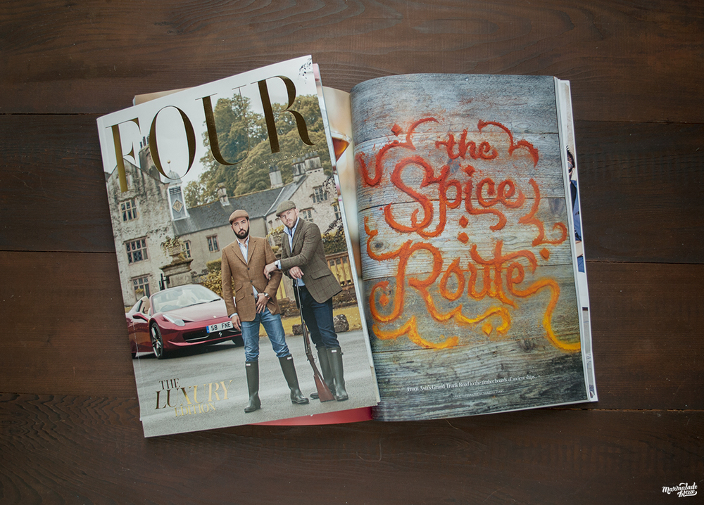
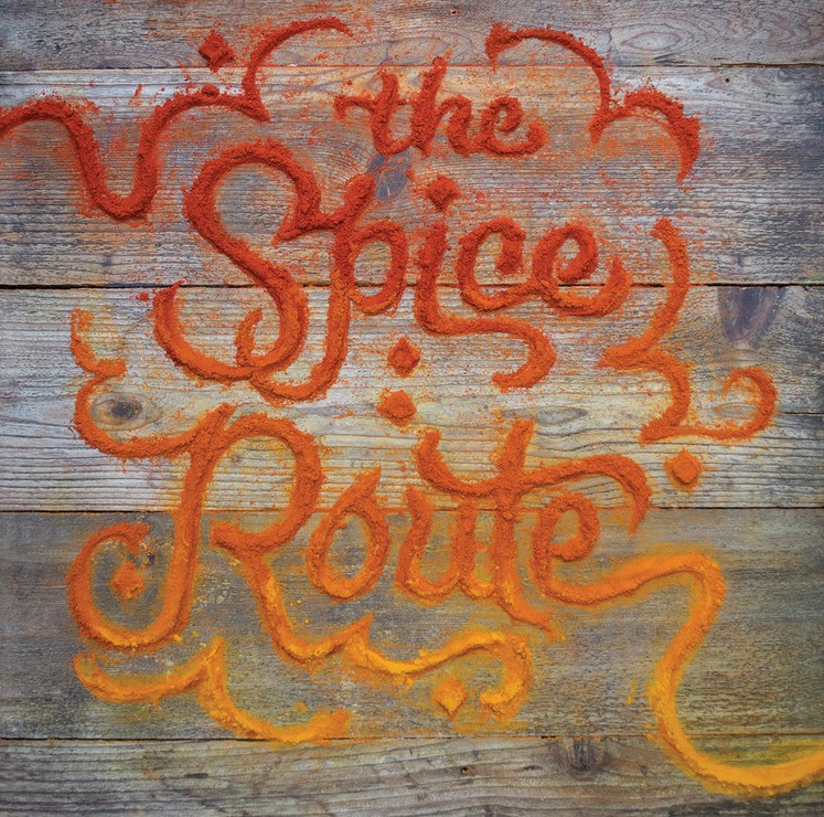
FOUR, a culinary magazine based in London and Dubai, asked for a beautiful title script to highlight an article on sourcing exotic seasonings across the famous Spice Route.
Evans began experimenting with food and lettering. “Food is a cost-effective and ideal material. Because my work is composed directly on the surface without sketches or stencils, I forced my brain to follow my eyes. Food type is therefore an amalgamation of my various interests—I’ve sculpted, written, illustrated, designed, painted, etc., and was looking for an enjoyable way to meld them together. This niche nicely encompasses all of them without relying too heavily on one or the other.”

Evans created these “Love you more than … ” cards for Valentine’s Day.
She notes that certain food types are more malleable than others, such as ground coffee, spices, and baking goods, and she is often asked to work with these materials. But she isn’t complacent about it. “To ensure I stave off any laziness, I make myself execute familiar foods and objects with more complex letterforms. Outpacing myself with each project is critical to my creative growth, something I enjoy observing over the course of each year. Some of my favorite materials over the years have been shaving creams, fabrics, and plants; these objects require more thought and planning to ensure they shine brightly and retain their elegance.”
Experimenting with new materials and pushing the boundaries with oft-used items excites Evans. “Divining the limitations of the objects I use and manipulating them to feel magical rather than placed gives me such satisfaction. I’ve pushed items too far and had them rip or break on me, but when I’ve suggested a lettering treatment that complements the object’s nature, I’ve hit the sweet spot!”
![]()
When starting a lettering project, the materials Evans uses usually dictate the lettering style and messaging. She notes, “I’ve always wanted my body of work to have layers of meaning stuffed into every piece to enhance the accessibility for every level of viewer.
“Food (and inedible materials) speaks without my help, making it my responsibility to curb its message with application, intention, and context. I enjoy using FiftyThree’s Paper iPad app as well as the Pencil stylus to capture most of my concepts, as my clients benefit from roughs with color and any additional information I can give them. The app keeps all the images in a sketchbook so I can come back to them later.”
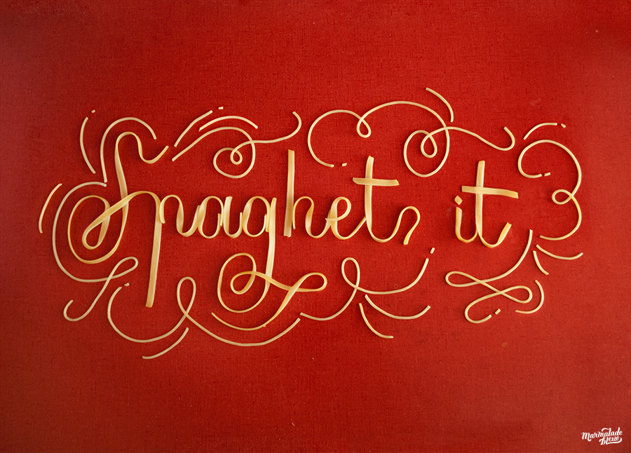
Evans fashioned a copperplate script using fettuccine by using the heat and starch of al dente noodles to create thick and thin line variations on her kitchen counter. She also used angel hair for ornamentation—while piping hot—to take advantage of the starch.
Regardless of material, each piece is lovingly handcrafted. “I usually request a specific item and brand that I’ve tested and a couple of back ups, should we run into issues. I may be asked to do a test on the intended surface for lighting and camera placement, which allows me to warm up to the substance.
“The creation portion of the day is the most basic but often magical to others—I put my head down and make whatever I’ve set out to do without stencils or grids, and occasionally without sketches, until the piece is finished. This part of the process can be most intensive, as the agency and client are usually present and wish to offer feedback during production.
“Once I’ve arrived in a finished place and everyone is satisfied with the lettering, I’ll begin propping and styling the final frame and ask the photographer to pop a couple of shots. These days can last between 9-16 hours, dependent on the number of pieces and amount of revisions. The marathon of my jobs is exhausting, but having a finished product at the end of the day is extremely satisfying. Usually I’ll come home and stretch, as I’m often bent over a board for most of the day, occasionally balancing on a table top or kneeling on concrete. If it’s a smaller gig, I’ll shoot it myself and spend the remainder of the day retouching the image to near-perfection.”
In case you’re wondering, as I did, her studio moniker, Marmalade Bleue, came about for a couple of reasons. There was no point in purchasing a domain with her name because she also happens to share her name of one of America’s Next Top Model winners and an up-and-coming writer. But she also wanted to appeal to an international audience. Evans says, “I had always loved French culture, and in studying the language hoped to land some gigs in the francophone market. This ended up being a great move for my personal sanity, as when my business was struggling, I had a degree of separation from professional ups and downs. When potential clients searched my name, I sounded exotic, which allowed me to find work throughout Europe and North America.”
Here’s a glimpse at Evans’ creative process as seen in this commercial for Tazo Chai blends, where she manipulates cocoa and caramel to create a delectable teaser.