As we’ve previously established, color has a profound impact on everything from how we respond to pieces of media to our physical health. Color can drive our behavior, change the way we think about about a product, or even help us fall asleep at night. But color doesn’t just influence us — it influences itself.
Few colors are in their purest forms — instead, they’ve blended with others. And understanding how those two (or three, or more) hues work with one another can help designers, photographers, and makers all walks fine-tune their creations and ensure consistency across platforms.
In his class, Color for Designers: Exploration, Theory, & Application, Richard Mehl explained the way that colors influence each other.
“A small amount of yellow is balanced by a lot of purple. About half as much orange is balanced by twice as much blue, and equal parts red and green balance each other,” he explained. “And those relationships are numerical.”
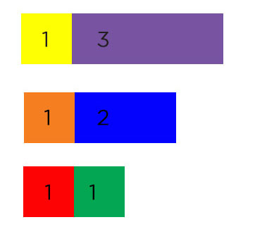 Think of it in terms of mixing paint. For example, yellow is a more dominant color, so just a small amount of yellow is needed to influence a larger amount of purple. If you want to get very technical about it, you can use the numbers, as Richard explains; the yellow to purple ratio of influence is 1:3.
This aspect of color theory is especially helpful for photographers. Consider the color balance adjustments in your camera: You know that your color seems not-right, but to what degree do you need to make an adjustment? If the image appears too yellow, you need to increase the overall purple tones, and you may have to do so to a degree that feels high. If it appears too red, just a small amount of green might be able to offset the imbalance.
For designers, too, it’s important. If your colors don’t seem to be jiving, you may need to balance one of them out by adding some of its complementary color.
“If you’re working with any kind of a composition or order,” says Richard, “this is a good place to go. Thinking about those relationships and proportion.”
Of course, these ratios really only apply to primary and secondary colors, but they’re definitely a good place to start.