Color theory has real practical value for designers, explains Playing with Color author Richard Mehl. The principles of traditional color theory are just like the other design principles we use every day—they are creative tools that can be used to solve visual problems. Different color combinations offer varying experiences and visual contrasts for the viewer, making it a critical component for graphic and interior design alike.
In visual communication, a color palette or color scheme is a set of colors that work together in ‘color harmony’ to express an idea—loud, quiet, light, heavy, warm, cool, conventional, avant-garde, etc. Most color palettes used in graphic design projects, like branding, are built around a base color, sometimes called a “hero color.” The hero color is usually supported by two or more colors. Some brands use two hero colors. In selecting these important colors, it’s critical to understand that certain colors pair together better than others.
1. Color Choices: Choosing a Hero Color
Choosing a hero color is often the easiest part of creating a color palette. The hero color is usually associated with a familiar idea. For example, we associate blue-green colors with cool temperatures, yellow-orange with warmth, red with passion, yellow-green with growth. Cool colors like blue can represent calm, serenity and peace. Nuance can be added to the expression by adjusting the lightness, temperature, or saturation of a hero color—all forms of color contrast.
Tune into the biggest photoshop event of the year! Join CreativeLive for Photoshop Week 2019, June 12-14, to learn how to produce professional quality photos and reach your full creative potential. Learn More.

2. Choosing Color Combinations
The supporting colors work with the hero color to express or complement the idea. Choosing the supporting colors isn’t always as easy as choosing the hero color. A basic awareness of color theory is helpful, especially the theories of color contrast. Let’s say our hero color is red. If we want our color palette to express unity, we can make the supporting colors analogous to red. A palette of analogous colors will almost always express unity because there is minimal contrast. Another way to express unity is to use monochromatic colors—a set of colors, all based on the same hue, but varying in lightness and darkness.
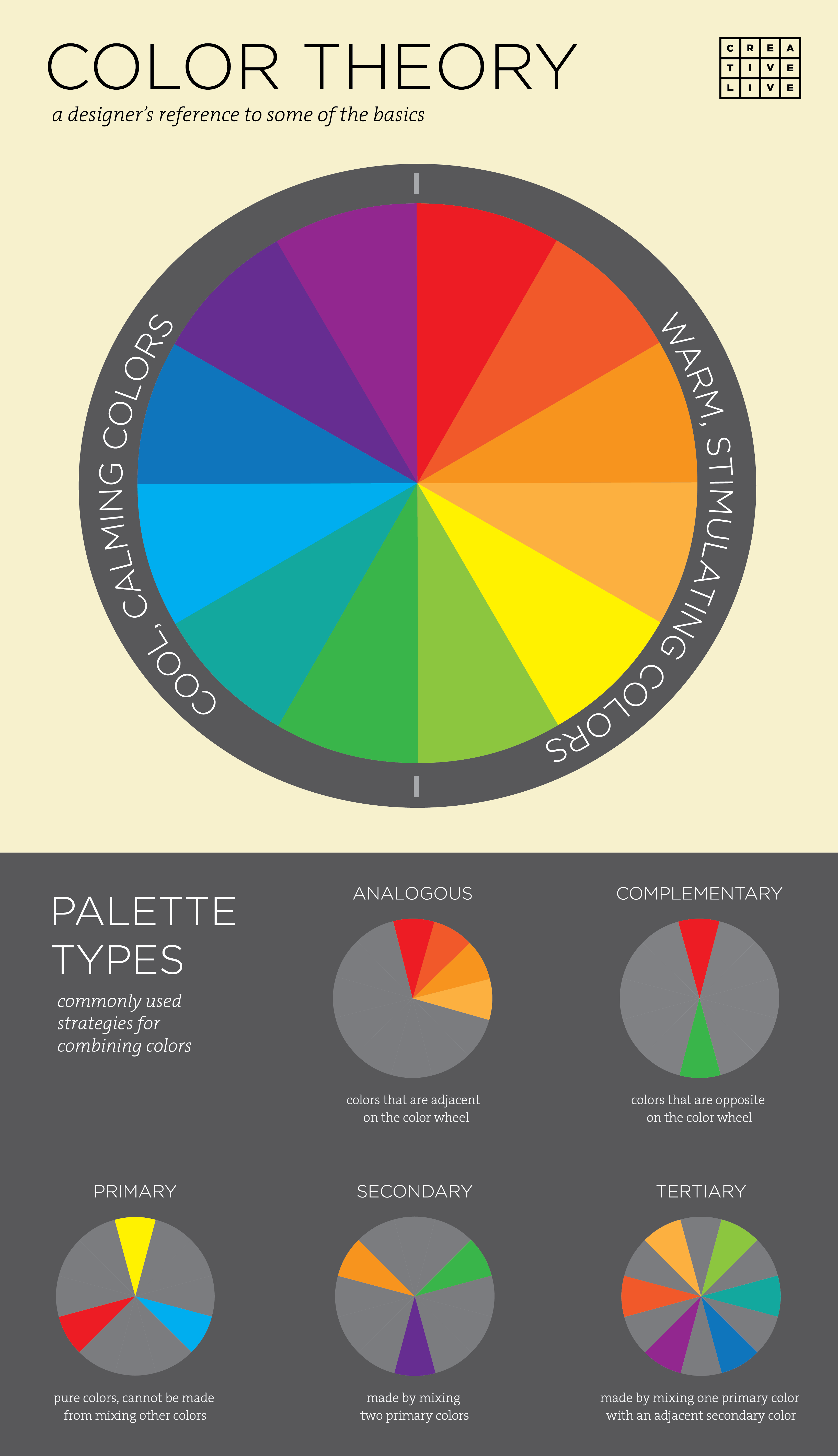
3. Understanding Basic Color Relationships
Primary colors and their cousins, the secondary colors, are color systems defined by extreme contrast, and they make excellent color palettes. We can build a color palette around a primary color or secondary (or tertiary colors which are made from mixing primary colors with secondary colors) that expresses difference. For example, if red is our hero color, and we choose the other primary colors—yellow and blue—as supporting colors, the palette will express extreme contrast and really pop. The lightness of yellow, and the coolness and relative darkness of blue, make the sensation of these hues completely distinct from the sensation of red.
Extreme contrast can also be expressed with complementary colors or with a complementary color scheme. Red and green, blue and orange, yellow and violet are all opposites on Sir Isaac Newton’s color wheel, and therefore, they represent the greatest difference in hue—the ultimate form of color contrast. As I write this, I’m watching the New York Mets playing in the World Series. Their brand colors are blue and orange, and as noted color theorist Johannes Itten wrote, they “…incite each other to maximum vividness.”

We see extreme contrast demonstrated in every set of complementary colors. But at the same time, we commonly see complementary colors together in nature and other examples of local color. We associate complementary colors with each other, so even though they are opposites, they seem like natural companions in a color palette.
Pro Tip: Try Adobe Color CC
I’m a big fan of this program. It has become an important part of my creative toolkit. It allows me to experiment with a variety of color theory principles to create color palettes. Try it for yourself and see what palettes you can come up with for your next design project.