The 2016 Political campaigns have been unleashed—mostly a sea of Republican hopefuls—and so have some pretty awful campaign logos. Here, three designers—Tan Le, Noreen Morioka, and Felix Sockwell—weigh in on most of the campaign logos to date, although it’s such a crowded field with new candidates jumping in daily, we may have missed a few.
As Le, group creative director for Anthem Worldwide, says, “I don’t really believe a voter will be swayed for one candidate or another based on their political logo. But as a branding tool, the logo’s job is to elevate recognition of the candidate’s name, and hopefully, create memorable differentiation for that particular candidate. If it does a good job, the logo makes the name more sticky in public media and mindsets. And if it does a great job, like Obama’s 2008 logo, it communicates a concept like Hope and Optimism.”
Hillary Clinton
![]()
Tan: This is the standout of the entire field, hands down. It’s been widely criticized as being too simplistic, too plain, too cliché. Well, the critics are wrong. To me this is an incredibly smart, iconic brand system that’s more than just a simple H and arrow. The system turns the monolithic logo into a vessel that can be filled with patterns, photography, and symbols that represent other concepts and ideologies for a specific message, community, and issue. As the campaign grows, the nation gets to see the system flourish and diversify from town to town, event to event. The logo adapts and grows with the campaign. Here in lies its brilliance. It’s also worth noting the subtle choice of the more informal, approachable Hillary, instead of the more familiar, and perhaps more laden Clinton name.
Noreen: Okay, I have to admit I was one of the many negative designers who wondered what the heck was going on. Now after looking at the whole lot of logos, I bow my head and say it really works. No dumb tagline, no stupid stars. Instead, appropriate colors, confident and will look awesome on a fricking t-shirt. I’m there. You don’t have to say her name. It identifies her. That’s called an identity.
Felix: By far my favorite for 2016. It’s very rational. Ladislav Sutnar-esque. balanced. Functional. Nothing not to like.
Jeb Bush
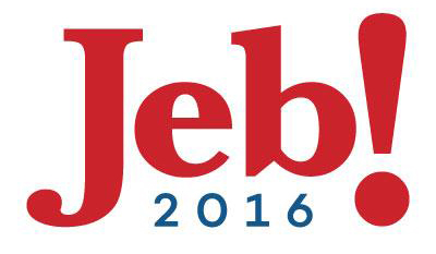
Tan: This is a smart choice by Jeb Bush to distance himself from the Bush brand and attract a wider voter base. The exclamation point seems contrived, but necessary to balance out the short name. Personally, I kind of hate logos with punctuation marks in them.
Noreen: “What did you do wrong? JEB! Get over here! Who was that? JEB!” Either I hear an old lady’s voice screaming or it looks like the start of a high school yearbook entry. “Jeb! Have a great summer! See you next year!”
Felix: Jeb! is awesome!!!! Seriously, I don’t get the “!” but it worked for him in his last campaign!! Maybe he’s just too conservative to spend money on a new logo this year!
Bernie Sanders
Tan: There’s something clunky and unsophisticated about his logo that fits the candidate. Everything about it looks awkward and generic. The star is disproportionate, the type needs kerning. But yet, there’s something genuine and unpretentious about the mark, like the candidate. It’s like a logo for a box of gluten-free cereal from Trader Joe’s.
Noreen: You just had to put that fricking star on that I. The stripes were enough.
Paul Rand

Tan: Despite how I feel about the candidate, I like this logo. I think it looks more like a scholastic or collegiate brand than a political brand, though. The use of the counterspace to hold the torch is nice. It’s like a flame-headed tuxedo man. Different iconology than the rest of the pack, and well balanced. Nothing amazing, but pretty decent.
Noreen: America, the insurance company.
Felix: Rand is my second favorite. I just think it’s refreshing and has great reproduction/applications. Sorry, I like it.
Marco Rubio
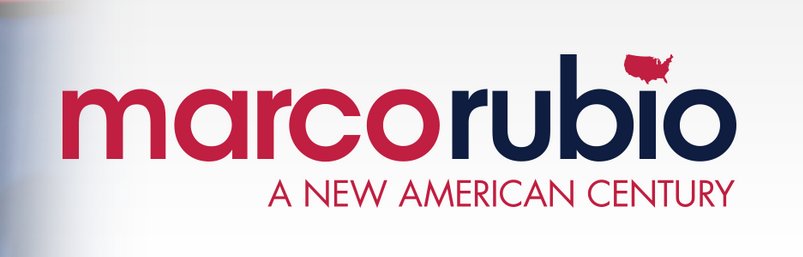
Tan: This is a long name, but I get why they chose to use both first and last name. Phonetically, it kinda rolls off the tongue as one word. It’s got a rhythm and cadence like a Spanish word, which I’m sure is intentional. The U.S. dotting the i is dumb, and the tagline is meaningless.
Felix: For all the fuss over this candidate I think his word mark is nicely played. It’s modern and isn’t like anything out there. Candidates and designers recognize the power of design after Obama 08. It’s a new logo landscape.
Ted Cruz

Tan: Not horrendous, but not great. The flame also looks like a teardrop. The font choice is nice, but it needs kerning. The 2016 is out of proportion and seems like an afterthought. Very corporate too, which might be intentional.
Noreen: I guess it works, but I’m not sure I want the American tear to represent us. There is no crying in politics.
Felix: Ted was first outta the gate so he got beat up, unfairly. I think this mark is tidy, simple and different. Who cares what it means. At least its slightly unusual and doesn’t traverse the typical trite flag waving BS.
Lincoln Chafee
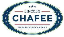
Noreen: Lot going on here. It is funny how the word “Fresh” should really only be used when describing produce.
Felix: Chafee really chafes me. Fresh ideas for America? Please. This belongs on a stale coffee can.
Mike Huckabee

Tan: As the candidate with arguably the most distinctive name, this logo needlessly adds the full set of elements from the political logo kit. Stars? Check. Bank of America farmland mosaic? Check. Horsey alliterative tagline? Check. Put it all together and what do you get? Looks like an all-state girls’ gymnastic team competition logo.
Noreen: So, I see a little bit of a Bank of America logo rip-off. Damn those stars, again!
Felix: Huckabee wins the award for worst of 2016. Look at this mess. Yellow is a terrible idea for a third unnecessary color. It also has a Bank of America thing going on. 2016 is way too thin. It’s just uninspired.
Carly Fiorina

Tan: Similar to Chafee, this is a candidate with a lower knowledgeability factor than the rest of the field. Her logo is elegant, probably fits her and her platform, but it’s quiet when it needs to standout. It looks like a new brand of professional women’s wear for Macy’s.
Noreen: Today at Macy’s, it’s Carly.
Felix: Carly didn’t need “for president.” It suggests we don’t know who she is. And guess what? We don’t. And won’t.
Chris Christie
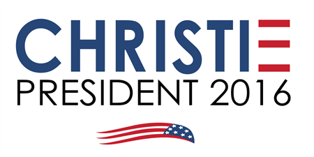
Tan: On the one hand, this could’ve been a traditional political logo with a bold name and statement that dares to stand on its own. A bold bumper sticker. But the choice of typeface is middle of the road, and lacks any distinctiveness or personality. The tagline is laughable.
Noreen: Look, kerning is really important. My clothes feel tight looking at that. I’m going to diet now.
Felix: Christie’s is like a carbon copy of Huckabee’s. The whole fat/thin thing is supposed to feel strengthened, modern. But it comes off as something you’d see for 41 and 43 (the Bushes). It’s old school. This is tied for worst.
Scott Walker
![]()
Noreen: Except for the bad keening between the W and A, I think this one is pretty good. Wait, maybe it shouldn’t have had the “for America.” Now with the flag as the E, this went from good to “pizza, pizza!”
Felix: Wow. That’s strong. Nothing to complain about here, except Scott Walker. ☺
Rick Perry

Tan: The seal is a decent idea, but poorly executed. The Perry name is minimized, and the busy P glyph is poorly stylized and illegible.
Felix: Easily the worst of the bunch, this caters to Texas Rangers fans. The lower portion of the letter P is angled, or stationed in a way that makes little sense. It looks cheap, badly crafted, and unprogressive.
But what about Trump ?
1) Trump’s — I can’t seem to find a consistent logo for the Donald. His event logo doesn’t match his FB page logo. For a man who knows branding, this is surprising. Regardless, what I can find is underwhelming. But you can argue that the man, or rather his mouth, is the biggest brand he ever needs.