![]()
Designer Brooke Bucherie, from Austin, Texas, was obsessed with type and hand lettering, so she collected it … sort of. She randomly gathered screen shots of type she loved online, and when her iPhone ran out of space, she started an Instagram feed called @Goodtype in 2013, to store her collection, crediting the artists who created the lettering. Over time, she noted that artists were hash-tagging their type pieces #goodtype, and people started following her feed—a lot of people. The Instagram feed now has more than 185,000 followers, and the numbers increase each week.
With its growing popularity, she’s decided to publish a book that will feature 100 never-before-seen lettering samples submitted by the Goodtype followers. Bucherie says, “I’m so excited to bring the Goodtype feed to life into a tangible form. I want to expose the work of these many talented individuals and get this book onto as many bookshelves, coffee tables, and classrooms as possible.” She’s planning on starting a Kickstarter campaign to get buy-in from her huge following so she can self-publish the book. “It should be a lot of fun and a great way to reward our followers,” she notes.
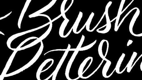
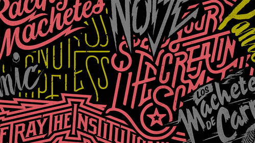
Here, Bucherie shares her five recent favorite type submissions on the @Goodtype feed.
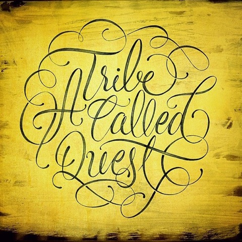
“A Tribe Called Quest” by Doug-Graphics is a really cool hand-lettered piece. I like the composition of the letters and how the elegant flourishes are arranged around the piece. I also love the yellow texture in the background. And I love that it’s hand lettered with a traditional calligraphic style referring to a hip-hop group.
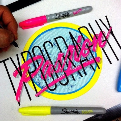
“Typography Passion” by El Jauntastico is absolutely stunning for many reasons. I always enjoy a good, clean sans serif. And I love it even more when it’s combined with a crazy hand-styled piece. The way the letters interact with each other is quite incredible. The colors for this piece contrast perfectly with each other. It’s clean, it’s playful, mimics no other style, and has great dimension.
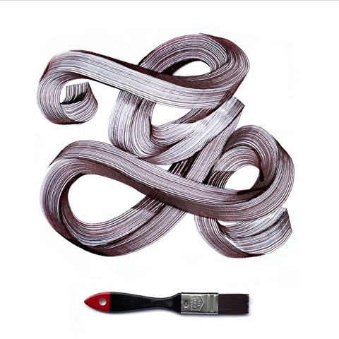
This “G” by Vincent de Boer blew me away the first time I saw it. I’ve never seen one letter display so many different dimensions and textures. It’s beautiful! I still don’t understand how he accomplished the final look of that G. I can’t imagine this being done with one stroke. But that’s the point! And he succeeded!
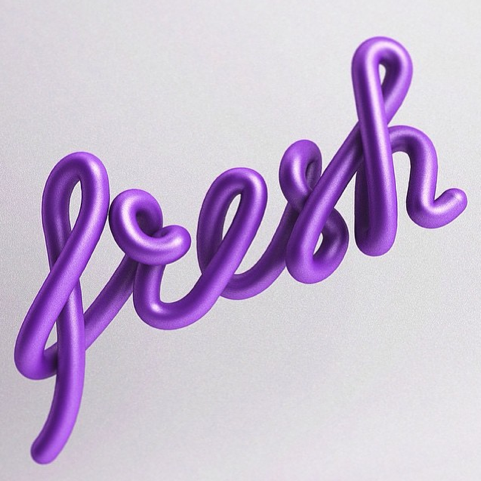
“Fresh” was done by Andrew Footit. I love the purple color against the clean, light gray background, the hand-lettered script style and the three-dimensional aspect. It truly is a fresh piece and I haven’t seen many like it. I’m intrigued by 3D illustrations because it isn’t a design process I’ve familiarized myself with yet.
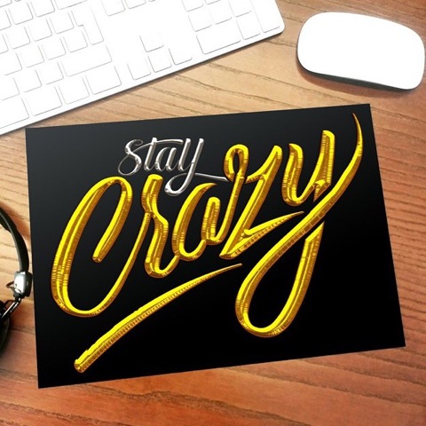
“Stay Crazy” by rigosREACTION is quite an exquisite piece. The lettering itself is practically flawless. I love this one for it’s realistic shadows. To me, it mimics the texture of a silver and gold helium balloon. He did this with acrylic ink, although I’m not entirely sure how he created those textures. Overall, it’s simple and clean with sharp contrast, great dimension, and a fun message!

I wanted to create a little something for my top featured letterers as a token of my appreciation for their work. So I decided to work with Bell & Oak on making these one-of-a-kind leather fobs. I did the lettering and they made the fobs and did the stamping. I was very pleased with how they turned out.