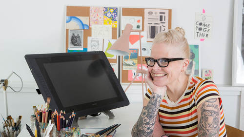
Andrea D’Aquino’s illustrative ramblings run the gamut from watercolor to collage to everything in between, and it’s perhaps because of this cataclysmic range that she was chosen to illustrate this fantastic tale of two worlds for Rockport Publishers for its Classics Reimagined series. We go down the Rabbit Hole with D’Aquino, as she talks about the challenges of reinterpreting this classic through her eyes.
Is this a story you’ve always wanted to illustrate?
It’s my favorite book, but by no means had I ever considered illustrating it, nor would it ever have entered my mind. The idea to tackle such a classic text would’ve struck me as almost preposterous after artists from Dali’ to Disney, to Tim Burton—to the definitive Tenniel illustrations—have already been imprinted onto such a wide swath of our collective minds. How would I follow up on such a thing?
But, when I was asked to illustrate it, I didn’t hesitate for a second. I know a great opportunity when it hits me over the head! I did really worry for a week or two, wondering how I would ever approach it, and make it fresh. It’s full of classic scenes that so many of us have preconceived images.

How do you even start a project like this? Do you map out the whole book and think of narratives to illustrate?
I’m not one to map out or plan too logically, I react to things spontaneously and almost impulsively. I do as little “thinking” as possible, once I actually get into it. I like things to feel fresh, not studied. I actually decided to jump into it dead center with the chapter, “Advice from a Caterpillar.”
It’s well-known, yet not as iconic as say, “A Mad Tea Party.” I pushed it as far as I could, and I was delighted to discover that I was indeed fortunate to work with an art director and editor who were both totally open and trusting to however I chose to interpret things. In fact, the personal and idiosyncratic take is very much the point of the whole Classics Reimagined Series, and this is nothing less than a blessing, as far as I’m concerned.
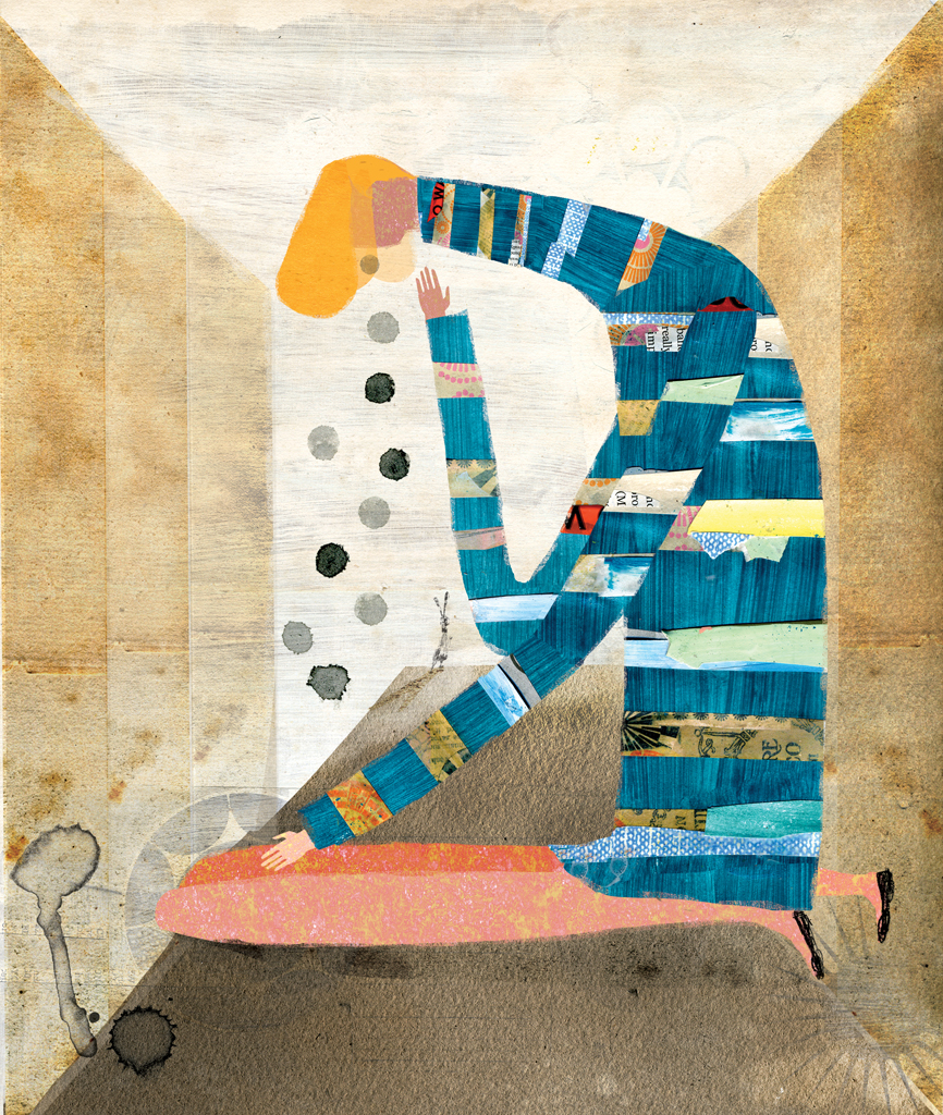
You have a couple of very different, yet distinct styles — watercolor and collage. How did you determine which style would work for which scene?
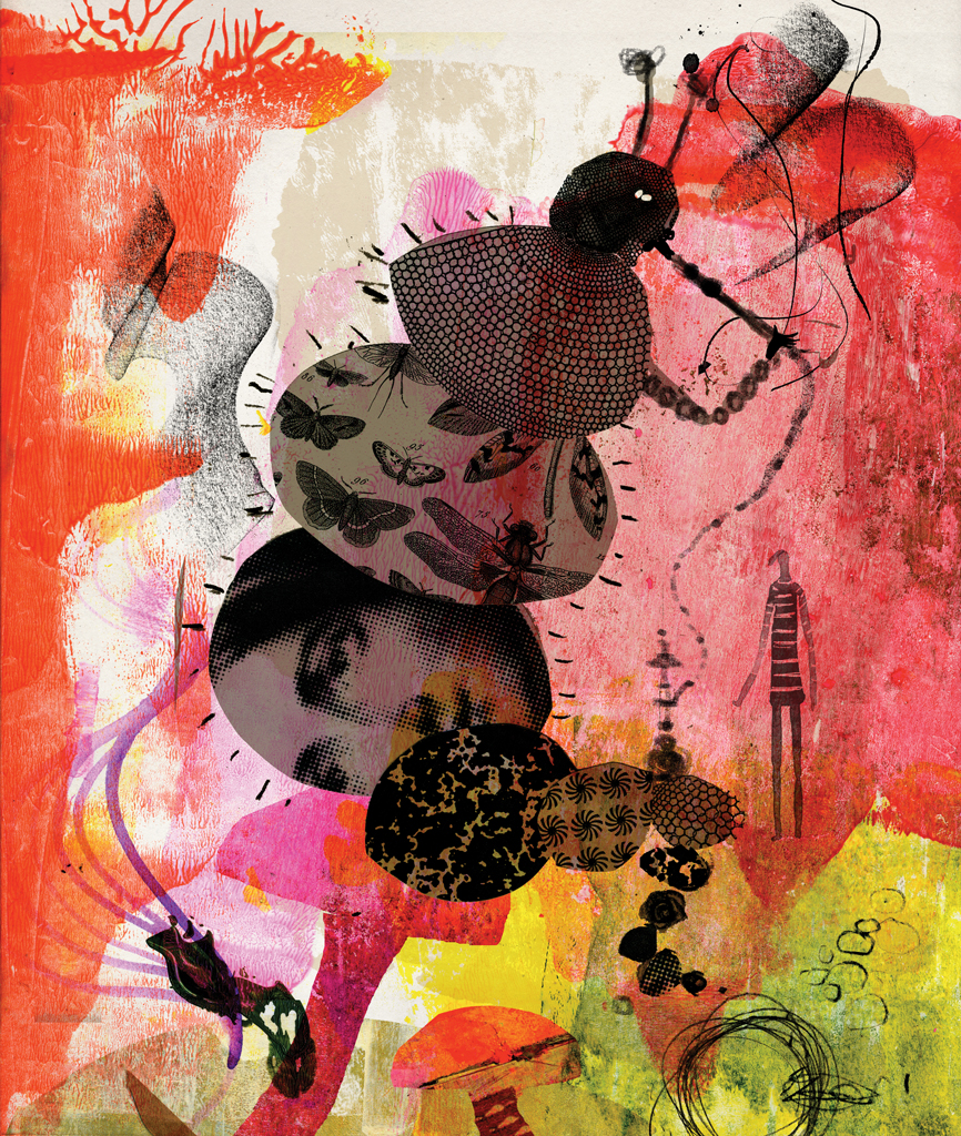
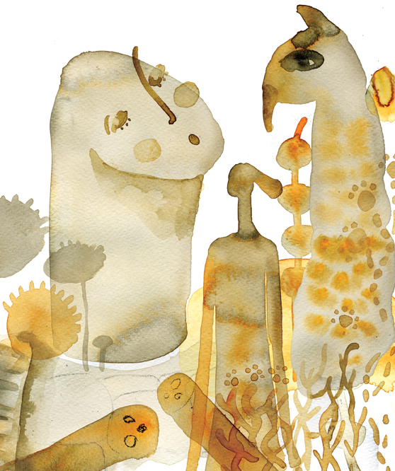
I reacted to the text from my gut. I also feel an element of visual surprise is important. At 245 pages, I didn’t want fatigue with a particular approach to set in or become predictable. There is a very general overall color-palette that each chapter adheres to (though not slavishly). The opening is more naturalistic, with blues and greens. The Caterpillar, perhaps the most psychedelic, explodes in reds and purples. “Pig and Pepper” is weirdly dark and somber.
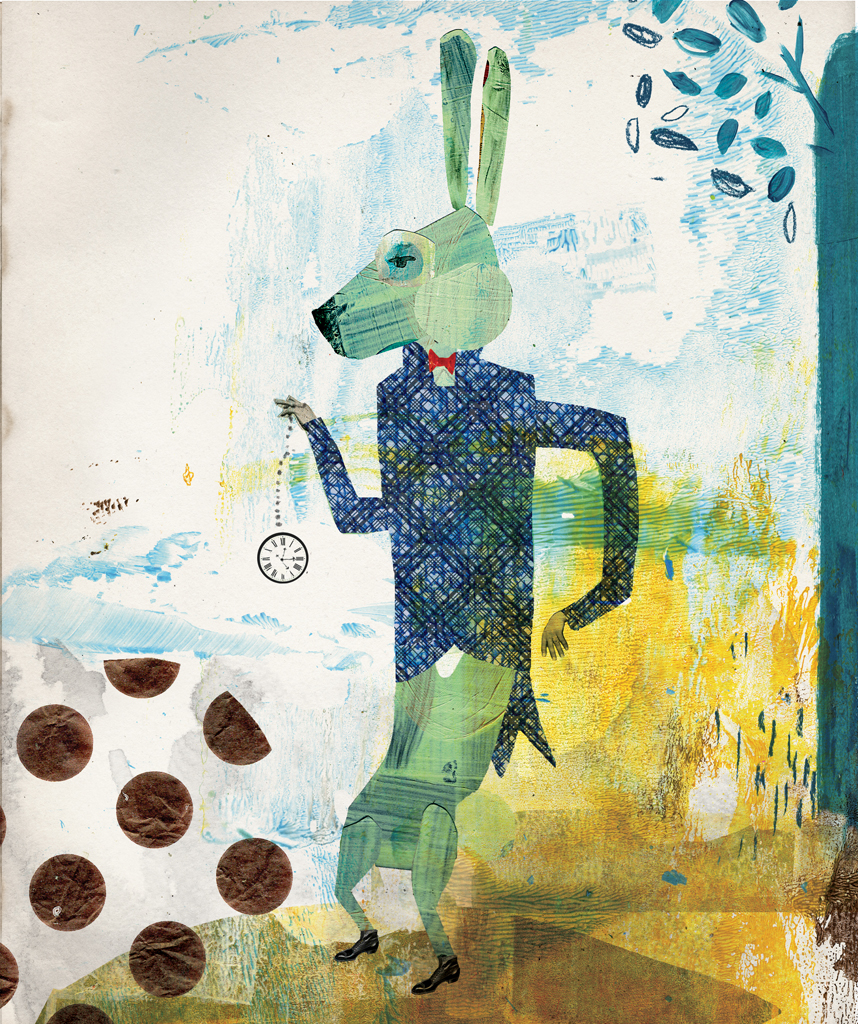
The “Mad Tea Party” is literally tea-stained paper, which led to sepia-toned photography. It’s the only chapter that’s photo-collage. That was one of the last chapters I got to. I felt the most pressure, as it’s probably the most iconic scene in the book. I avoided looking at anything “Alice” at all costs, yet there was something almost so obviously logical about it — I felt it was a big idea.
Learn the fundamentals of color from award-winning illustrator Mary Jane Begin. Watch now.

You also combine these styles quite a bit. Tell me about your illustration style and how it’s evolved.
I do like to cut up ephemeral bits and pieces of paper, old paintings of mine, but almost never “nice” or “pretty” bought papers. It’s more old junk that has a history and has likely been ignored on the street or literally the garbage pail (mine or someone else’s). I like the immediacy of chopping things up and having the freedom to move things around, almost like on a stage. A crazy amount of it is accidental and unplanned. Things fall into place remarkably often, if you allow them the space and don’t over control the process.
Simply for visual contrast, and not to bore myself with constantly doing the same thing, I just gravitated toward watercolor/ink. I realized that it essentially has the same attributes that I like. Water is unpredictable and messy….it does what it wants. I don’t use “correct” techniques, I mix ink with “wrong” materials, I let things get messed up, or, ideally — to be on that boundary between control and a total mess. That’s the most interesting place for me, when things turn out the best. So I see them as both mediums where mistakes and accidents are your friends. I like the indeterminate look of ‘blobby’ faces—not overly descriptive or detailed. I’m bored with too much information in a story. I like when there’s space for your own brain to fill it in, where it’s distorted, or weird, or wrong. That’s where “art” happens, for me.
How long have you been an illustrator? How would you define what you do?
I’ve drawn and painted ever since I can remember as a kid. I studied graphic design in art school. Fine Arts or even illustration seemed like things privileged people pursue. I came from a comfortable, but solidly middle/working class background, so I pursued the practical route. That said, after 4 years of art school, I gravitated even more specifically toward the advertising world. At that time, the 60s – 80s were full of exceptional art directors and writers that were every bit as brilliant as any “real” artist. I was partial to the fact that it was words and pictures together: ideas. Not just pretty images. Eventually, I became an art director. I worked for many years in some of the very best creative agencies, with the very best people, and became rather senior and very experienced in all mediums from print to tv and later digital.
However, I’d also become older and grew weary of the business atmosphere and creative frustrations. I hate meetings. I hate “business” for that matter. I was feeling the lack of personal expression, so, I stopped working for long stretches, did a lot of traveling, and naturally, the illustration side emerged. Now, it’s really where my heart is. Since I adopted it at an older age, I try to stay true to myself, rather than pursue too obvious a commercial approach. Of course, I do wish I got more assignments, and that everyone would “get” me and see how my work can apply to many more things, but I’m learning to stick even more to who I am. This book has helped reinforce that concept for me. Stick to the quirky thing that you do well, whatever on earth that may be.
Did you work closely with the book designer during the process?
Rachel Willey was recommended to me by one of the greatest book designers there is, John Gall. I’m a decent designer, but I wanted to concentrate on the art only. Beyond a very basic conversation that I saw the book as completely modern, clean, plenty of white space. Nothing that would date it in 10, 20 years, or be trendy or cute, or childish, she ran with it, after I’d completed all the art. I left her totally alone for a few months. When she showed it to me, I essentially didn’t change a thing. It was perfect and intelligent, and beautiful. She surely made some choices that would have eluded me. She had fresh eyes. I’m very grateful to her.
Overall, the experience of making a book has really whet my appetite for doing more literature, or more anything, really! I’ve gained more trust in my own quirky, personal approach. It was an intense but gratifying experience to produce so much volume in a rather short time, that was a great exercise. I’m happy to say, I think I will indeed be working on a new book project this year, though in very different genre and subject matter.
Learn the fundamentals of color from award-winning illustrator Mary Jane Begin. Watch now.