In the world of type and design, there are a number of typography terms that are either commonly confused with other terms, or are simply misunderstood in their own right. In this blog post, we will shed light on three pairs of words that are widely misused. The words in each pair are related, but they refer to different things – and they are not interchangeable.
Font vs. Typeface
Many people who use fonts everyday have begun to say “font” when they really mean “typeface.”
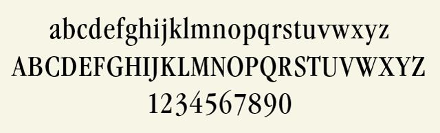
Typeface refers to the style, or design, of a set of characters (such as the Helvetica, Bodoni, or Times Roman typefaces).
Font, on the other hand, refers to the technology – or method – used to reproduce or set the typeface.
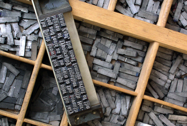
Today’s digital fonts are created with font production tools; these fonts are considered to be software. In phototype typography, which preceded digital technology, a font refers to the film onto which the typeface is imprinted. In metal, a font refers to every character included in a single size of a particular typeface. Each point size of a given typeface – such as 8 point, 10 point, 12 point – is considered a different font.
To summarize, designers select typefaces for their work, but then use fonts to create the actual document or design.
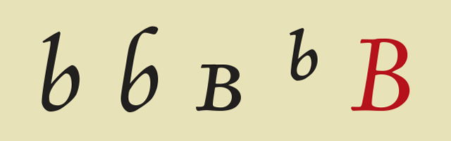
Character vs. Glyph
A character is the symbol representing a letter.
A glyph is the specific shape, design, or representation of a character.
The character a can be represented by many glyphs set in different typefaces. In addition, more than one glyph can represent one character in the same font. For example, a lowercase n character may be represented by glyphs of a standard lowercase n, a small cap n, and a swash n. However, a cap N and an italic n are different characters.

Legibility vs. Readability
These two terms both relate to ease of reading from a typographic perspective. However, they are not synonymous.
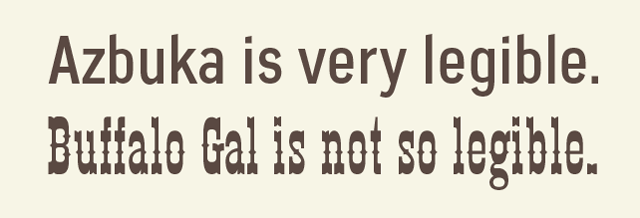
Legibility refers to the design of the typeface.
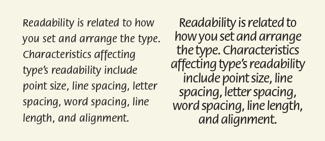
Readability refers to how the typeface is arranged.
The legibility of a typeface is determined by the characteristics of the design, including x-height, character shapes, width, stroke contrast, the size of the counters, and weight – all of which contribute to the ease of distinguishing one letter from another.
Readability, on the other hand, relates to how the type is set or arranged. Factors affecting readability include point size, line spacing (or leading), letter spacing, word spacing, line length, and alignment.
Want to brush up on more typography terms and skills? Go back to the basics with my class, Typography: the Fundamentals.