Brands and advertisers are forever trying to capture new and different demographics. Younger, more diverse, more male (or sometimes more female, depending on the product), more “urban” (or any other number of polite euphemisms that refer to the race or ethnicity they’re trying to woo) — whatever ways you divide up your personality, someone is trying to get you to buy something you wouldn’t normally, according to their data, buy. And often, one proposed method of drawing attention is with a rebrand. Maybe it’s freshening up an out-of-date logo, adding a different tagline that seems more in line with the kind of customer they’d like to see, or an entirely new approach to the company — whatever it is, a rebrand is usually a sign that a company wants more people thinking about it.
And usually, it works, though not always for the reasons that companies hope. Often, rebrands are so jarring or unusual that consumers react negatively. And some rebrands have been so spectacularly strange and even downright bad that they’ve entered the Terrible Rebrand Hall of Fame.
Surely you remember some of these:
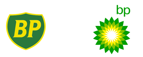
BP: Even before the explosion of the Deepwater Horizon and subsequent months of oil gushing into the ocea, BP had something of a public image problem. They wanted people to see them not just as an oil company, but also as an energy company. Rather than “British Petroleum,” BP was now meant to stand for “Beyond Petroleum,” as the company expanded into other forms of fueling. They unveiled new advertising, messaging — and a new logo, called “Helios, after the sun god of ancient Greece” according to a press release. Unfortunately, after the horrific Deepwater explosion and spill 10 years after the rebrand, all of their rebranded material — which touted the company as green and environmentally-minded — suddenly seemed farcical. The new logo, too, left BP extremely vulnerable to online mockery, as people around the world took to Photoshop to make their own versions. The press was so bad, the company considered yet another change in name or branding, but decided against it, due to their relatively recent refresh.
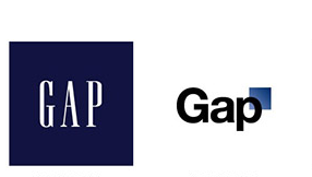
Gap: In retail, Gap is what’s known as a “legacy brand,” meaning it’s been around forever. People are familiar with its logo, its branding, and to a large extent, its offerings. Basics like jeans and t-shirts are as reliable as the company itself, which has footholds in practically every town and outlet mall across America and plenty of other nations, too. So when the company — facing a rough economic outlook as a result of the recession — tried to win over a new audience with a fresh take on its old logo in 2010, everyone took notice. And, to their dismay, almost nobody liked it. On social media, consumers railed against it. On Wall Street, the company’s share prices dropped. The company quickly switched back to the old logo, admitting the mistake and apologizing to consumers.
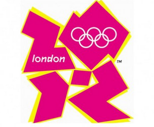
The Olympics: Every cycle, the organizing committees of the Olympic games try to come up with a new way to attract viewers — and every time, they make questionable design choices. Take your pick: Do you prefer to complain about London’s jagged shapes that looked like it was drawn by a child? The Vancouver Olympics’ image, which reminded some individuals of “a smiling marker of death”? Or maybe Barcelona’s weird smile that looks like it belongs in an elementary school classroom?
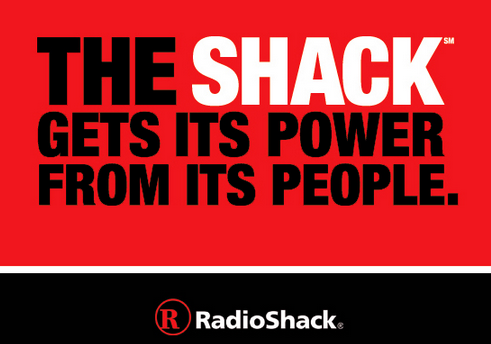
RadioShack: If you want to make something cool, just stick the word “The” before it. That was the mentality of the late 2000s and early 2010s. Bands like the Strokes and the Shins were big, and companies started hacking apart their original names and adding “the.” Pizza Hut briefly became “The Hut” (and let’s agree to never speak of that again), and Radio Shack famously became “The Shack.” Because, of course, radios weren’t exactly hip, and, to be honest, neither was Radio Shack, a store best known for selling RC cars. In a world of slick Apple stores with “geniuses” to help out, no one wanted their electronics from guys with lanyards anymore. Their shares were falling like crazy and they were shuttering stores left and right. So, they tried to rebrand and win everyone back. It didn’t really work, as “The Shack” was just a little too hard for people to say with a straight face. This story has a happy-ish ending, though; RadioShack decided to revert back to its old name (saying that they never really wanted to rename it — “The Shack” was just a nickname!) and have continued to try to get customers back in the doors through less-dramatic marketing ploys, like funny Super Bowl ads.
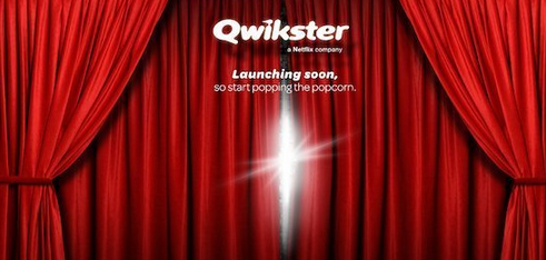
Qwickster: If you don’t remember Qwickster, it’s not because you’re too old — it’s because it happened too quickly (qwickly?). Alive for just a few weeks, the DVD-specific arm of Netflix was supposed to be separated from the company’s new main focus, its streaming service. Originally started as a DVD rental service, Netflix smartly pivoted to offering streaming content as the masses began to move away from DVD usage. However, Netlix — who still had all of their DVDs and the infrastructure in place to keep shipping them — didn’t want to completely do away with its initial offering. They decided to brand it separately, and thus, Qwickster was born. And just a few weeks (weeks filled with mockery, head-scratching, and a Twitter account that Netflix couldn’t seem to wrestle away from a now-internet-famous teen) later, it was ushered right back out the door.
“It is clear that for many of our members two websites would make things more difficult, so we are going to keep Netflix as one place to go for streaming and DVDs.
 This means no change: one website, one account, one password… in other words, no Qwikster,” wrote CEO Reed Hastings on the company’s blog.
New Coke: Probably the crown jewel in of terrible rebrands, you can’t mention “refreshed” messaging without mentioning New Coke, Coca-Cola’s answer to a younger, Pepsi-prone generation. What made New Coke such a cluster? In part, Coca-Cola did what none of the other brands dared: They changed both the name and logo of the company and the product. New Coke didn’t just look different, it actively tasted different, thanks to an “improved” formula.
Overwhelmingly, consumers said they preferred the old stuff, leading Coca-Cola to release its old formula back onto the market, this time branded as “Coca-Cola Classic.” The failure was so spectacular that some insiders have wondered if the whole thing was planned, but Coca-Cola has always stuck to its guns, saying they really were just trying something new. Interestingly, New Coke didn’t damage Coca-Cola that much in the long run; The soda market, analysts say, is still dominated first by Coca-Cola, second by Diet Coke, and third by Pepsi.